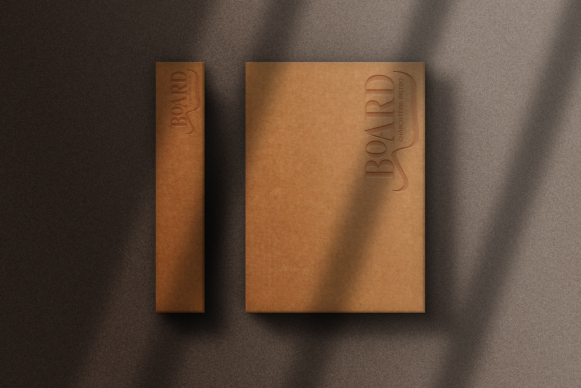
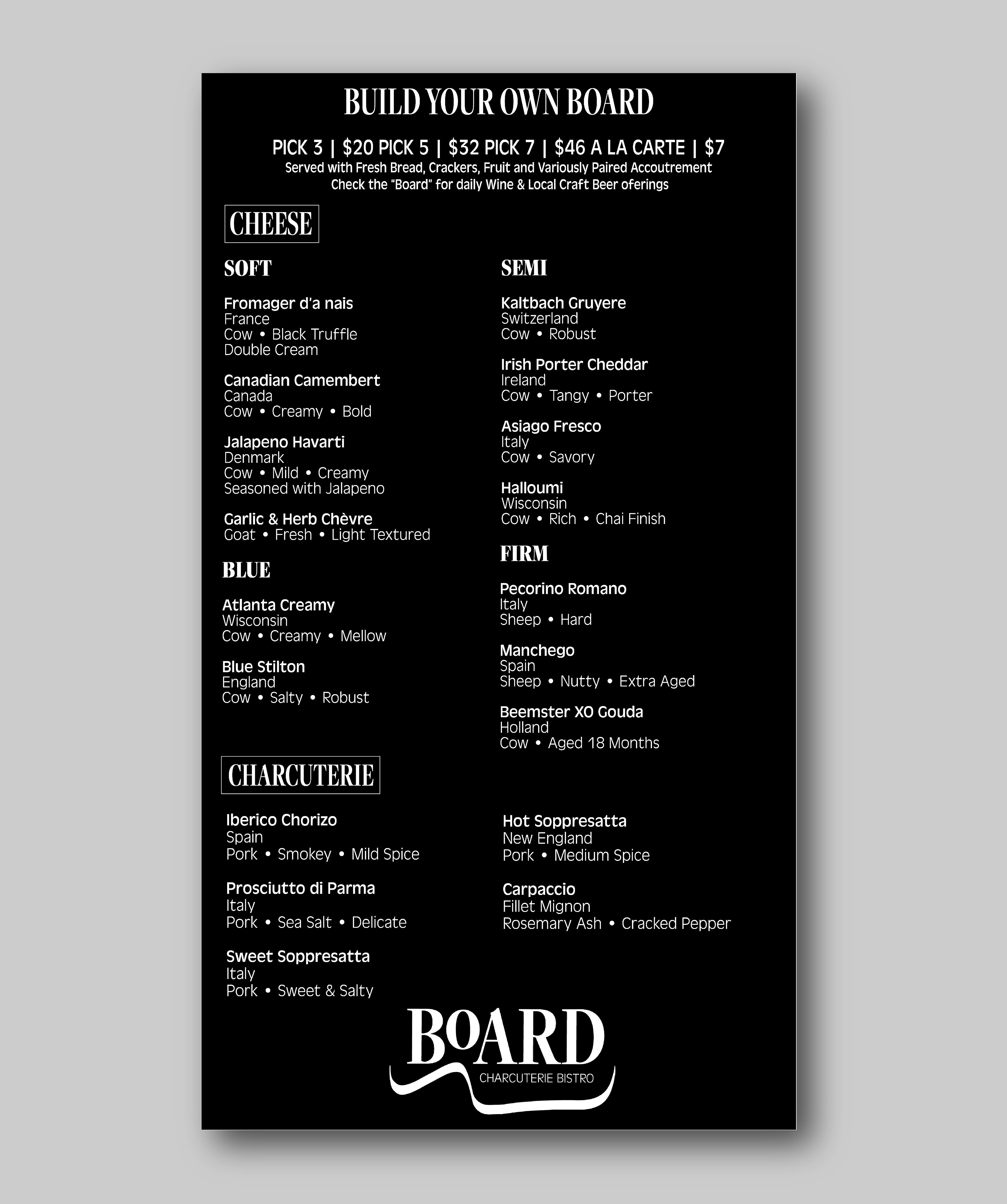
I developed a visual identity for a new fictitious restaurant concept, BOARD Charcuterie Bistro. The logo features an artsy wisp representing the outer edge of a charcuterie board. While BOARD exhibits in an eye-catching font style, Charcuterie Bistro has a more mild form. The chosen fonts help get a feel for the Charcuterie experience as you have heavier options such as meat and lighter fare such as fruit, nuts, and olives.


